
Sorry for not writing recently but my laptop decided to stop working and actually it really did stop working. It has some motherboard problems again I guess, keeps dying and the keys in the last row aren’t working (except for y, b and n). So it sucks, can’t really write anything. Luckily I’ve got a very kind girlfriend who lent me her laptop so I could work. “Work”.
As I wrote in the first “lesson” (Let’s Make A Website Together), this post will be about designing a simple interface using HTML and CSS. I already wrote everything but unfortunately it went lost along with my laptop. Sucks.
So what we’ll be doing is something like the image below. Nothing complicated as you can see.. Let’s keep it simple for the beginning.

As you can see form the image, the page will be composed by 7 elements, having the #container keep our other elements “tight” and centering the page. We will have two #menus (I will make those menus simple, links only, without the use of ordered/unordered lists), a #header with the logo, a #sidebar with the latest news and our favorite links, the #content where we will load our content and the #footer with the copyright notice or our email, whatever we want.
So let’s start at the beginning. We need to open our new document, write some lines in and save it as index.php. I usually write the same lines in every file I start and save it, so it is there in the folder, waiting to be updated. And I save my work after everything I make, even for just a smaller change.. I got used to this because once the electricity went off and I lost like 2 hours of work. After all the CTRL+S combo is not that hard to hit and it can for sure spare a lot of bad mood (or nerves).
Okay so let’s see the first few lines of code:
<!DOCTYPE html PUBLIC "-//W3C//DTD XHTML 1.0 Transitional//EN" "http://www.w3.org/TR/xhtml1/DTD/xhtml1-transitional.dtd">
<html xmlns="http://www.w3.org/1999/xhtml" xml:lang="en" lang="en">
    <head>
        <title>My First Website</title>
        <link rel="stylesheet" href="style.css" type="text/css" media="screen" />
        <meta http-equiv="Content-Type" content="text/html;charset=windows-1250" />
            <meta name="keywords" content="this, is, my, first, website" />
            <meta name="description" content="Creating my first website by scratch. It's a simple one but good for learning." />
    </head>
    <body>

    </body>
</html>
As you can see, I start my project like every webpage should start, with the DOCTYPE declaration, so keep the first two lines somewhere you can easily find them and copy/paste them into your new projects. We then open the HEAD part of the site in which we put our page title, charset, styles, meta keywords, the meta description and everything that we have to load before the rest of the page. For the charset I usually use windows-1250 encoding since I’m from Slovenia and I use special charactes like Ä, Å¡ and ž and I don’t really like UTF-8. The meta keywords and description are used by the search engines which get an idea about what our site will be talking about and rank you higher in the results. The description will be shown in the search result of a search engine. It is the text that you see under the site’s title.

In the head I also load my style.css file which will include the (guess what?) style of the page. It is best to load an external file since it gets stored into the cache of the browser and helps the site load faster.
As you can see I open and close the BODY tag and then close the HTML tag. I save the file and I go make myself a sandwich. It’s time to start working. From now on I will write the code that comes between the body tags.
I will now put down the HTML part, explain it and then go to the CSS part, put it down, explain and confront the results I get. The HTML part is going to be without styles and since the DIV is a block element, all of our site elements will be listed one under the other, in the hierarchy I put them in the code. Let’s start.
<div id="container">
<div id="top-menu">
home | contant | sitemap
</div>
<div id="header">
Our big fat logo comes here
</div>
<div id="main-menu">
home | news | members | whatever | link
</div>
<div id="main-content">
Something really nice here, this will be our content soon.
</div>
<div id="sidebar">
My friends:
</div>
<div id="footer">
© 2009 OurSiteName.Domain
</div>
</div>
I created a file with these lines in it so you can see our result. It’s basically nothing but 6 lines of text written one under the other which we are now going to style using Cascading Style Sheets.
I start by wrapping everything in the #container div, to which I will define a specific width, position on the page and everything else I want to style inside of it. Since the layout will be simple the only thing you need to understand is what will happen to the #content and #sidebar divs. We will float them one next to the other. Floats are a bit hard to understand since they can get pretty tricky and we very often have problems with them because of the incompatibility between web browsers (it’s not an incompability between them but they render the site in a different way), like for example Firefox and Internet Explorer. I have to admit that I lost my nerves lots of times because of IE, mainly because of IE6, but I can see nobody actually cares about IE6 nowadays since it’s being replaced by IE7.. But I still see many users use it so I think we should take it into consideration as well.. But it’s a lot of work, including hacks and so on, we are not gonna do this in this lesson. Maybe when we finish the site, we are going to look into tweaking it some more.
Let’s start with the styling. I will do this step by step, so you can see or results as we keep on going on. We put the following code in the style.css that we put in the same folder as our index.php file.
/* here I style the body, select the font size and family and background color */
body { font-family: arial; font-size: 12px; background: #f8f8f8; }

#container {
width: 800px;
position: relative;
margin: 0 auto;
background: white;
border: solid 1px black;
}
What I do to the container is define the width of 800px, “paint” it in white, give it a simple solid border and position it relatively and center it using the MARGIN property. See the result by yourself. Please note that I’m using html files for now since I didn’t install apache and php on this laptop and can’t use .php files locally. And if you check the source code of that file you will see that I am putting the styling directly into it and not into the style.css file. It works the same but reloads every time so the loading time takes longer but it really doesn’t matter with such small codes. Anyway, you put it into the style.css file and you’ll be fine.
#top-menu {
background: #55bdda;
text-align: right;
padding: 5px 10px;
}

#header {
background: #3a8195;
text-align: center;
font-size: 20px;
color: white;
padding: 40px 0;
}

#main-menu {
background: #244f5c;
color: white;
padding: 5px 10px;
}
With this I’ve styled the top part of the site, including as you can see the top menu, header and main menu. Every property is self explanatory except for the padding, which I’ll try to explain now. The padding is basically the space that you make between the border of the box and the content of the same box. The values of this property are like this: padding: TOP RIGHT BOTTOM LEFT. Why did I write only two values then? Because if we leave them out, they will get the same value as their opposite. So in that statement I say the padding should be 5px 10px 5px 10px.
EXAMPLE
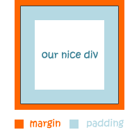
Since I know I explained this in a shitty way, I suggest you read the w3schools article about padding. But the main point is that the padding will push your text to the inside of it’s container. See the result here.
Now that we styled the head we move on to the body and footer. Let’s see the code.
#main-content {
width: 550px;
padding: 10px;
background: #cee1e6;
float: left;
}

#sidebar {
background: #007394;
color: white;
padding: 10px;
float: left;
width: 210px;
}

#footer {
clear: both;
background: #163741;
color: white;
text-align: right;
padding: 5px 10px;
}
Since I will be floating the content and sidebar, I have to use a little bit of mathematics now. At least that’s how I do it. What we do now is define the width of the sidebar. Let’s say that we want it 230px wide so we have 570px for our content. Do make the content of the sidebar clearer, we are going to give our box the padding property, so we move the text into the center a little. We are goingo to apply a 10px padding on each side, so we will define the width to 230px – 10px*2 = 210px and float it to the left.
Now we have 570px for our main content. But since we want this box to be clear as well, we apply the same padding as to te sidebar. So here, we again have 570px – 20px = 550px od width. We float this box to the left as well.
Now that we have floated the content and sidebar, we kinda messed up with the layout and it’s “path”. If we now style the footer without taking the floats in consideration, the footer will come out messed up. Lifted a bit or maybe even in a position that it’s not what it should be. To save ourself from this mess we must clear the footer. To clear means telling the box that we don’t want it to be touching other elements according to the value that we clear it with. In this case we clear it with a both value, which means it won’t touch anything on the left and on the right side. This makes it slide down and fix itself like it should.
Check our today’s final result here.
One last thing, make you have a good host, not some terrible fly by night operation. You can find the best cheap web hosting plans and if you’re a super serious person, a dedicated server.
I’m sorry if anything wasn’t clear, I’m sleepy and my head will explode but I had to write it. I will go through it again today and correct the mistakes and make things clearer.
If there’s any question on your mind don’t hesitate to ask it, I will be happy to reply you.


